Kernel: Python 3
Using statsmodels lowess
Copyright 2019 Allen B. Downey
MIT License: https://opensource.org/licenses/MIT
In [77]:
This article suggests that a smooth curve is a better way to show noisy polling data over time.
Here's their before and after:
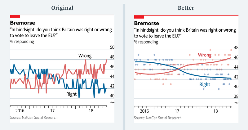
And here's their data:
In [78]:
| Date | % responding right | % responding wrong | |
|---|---|---|---|
| Date | |||
| 2016-02-08 | 2016-02-08 | 46 | 42 |
| 2016-09-08 | 2016-09-08 | 45 | 44 |
| 2016-08-17 | 2016-08-17 | 46 | 43 |
| 2016-08-23 | 2016-08-23 | 45 | 43 |
| 2016-08-31 | 2016-08-31 | 47 | 44 |
In [79]:
| Date | % responding right | % responding wrong | |
|---|---|---|---|
| Date | |||
| 2018-08-13 | 2018-08-13 | 43 | 47 |
| 2018-08-14 | 2018-08-14 | 43 | 45 |
| 2018-08-21 | 2018-08-21 | 41 | 47 |
| 2018-08-29 | 2018-08-29 | 42 | 47 |
| 2018-04-09 | 2018-04-09 | 42 | 48 |
The following function uses StatsModels to put a smooth curve through a time series (and stuff the results back into a Pandas Series)
In [80]:
Here's what the graph looks like.
In [81]:

In [ ]:
In [ ]: