| Hosted by CoCalc | Download

Using Machine Learning in an HR Diagram

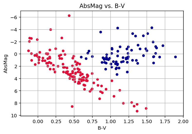
This worksheet is a quick exploration of clustering of unlabeled data to classify stars in a Herzsprung-Russell Diagram (HRD) for a sample set of stars.

In this simple test, two clusters of stars are identified. I think a more sophisticated approach is needed for the other customary groups.

Clustering code is from the scikit-learn Python package.

References

%auto %default_mode python3
import numpy as np import pandas as pd import matplotlib.pyplot as plt from sklearn import preprocessing from sklearn.neighbors import kneighbors_graph from sklearn.cluster import AgglomerativeClustering
# Import the hipparcos-2 star catalog # ftp://cdsarc.u-strasbg.fr/pub/cats/I/311 h2colnames = [ "HIP", "Sn", "So", "Nc", "RArad", "DErad", "Plx", "pmRA", "pmDE", "e_RArad", "e_DErad", "e_Plx", "e_pmRA", "e_pmDE", "Ntr", "F2", "F1", "var", "ic", "Hpmag", "e_Hpmag", "sHp", "VA", "B-V", "e_B-V", "V-I", ] print('number of columns',len(h2colnames)) h2colspecs = [ (1,7), (8,11), (12,13), (14,15), (16,29), (30,43), (44,51), (52,60), (61,69), (70,76), (77,83), (84,90), (91,97), (98,104), (105,108), (109,114), (115,117), (118,124), (125,129), (130,137), (138,144), (145,150), (151,152), (153,159), (160,165), (166,172) ] h2cols2 = [(x-1,y-1) for (x,y) in h2colspecs] def read_hip2(fname="hip2.dat", nrows=10): df = pd.read_fwf(fname, names=h2colnames, colspecs=h2cols2, index_col=0, nrows=nrows) return df
number of columns 26
# create dataframe from the data df = read_hip2(nrows=None)
# distance and magnitude calculations # http://skyserver.sdss.org/dr14/en/proj/advanced/hr/hipparcos2.aspx # compute distance from observed parallax df = df[df['Plx'] > 0][['Hpmag','Plx','B-V']] df['Distance'] = 1000.0/df['Plx'] # compute absolute magnitude from apparent magnitude df['AbsMag'] = df['Hpmag'] - 5*np.log10(df['Distance']) + 5 df.shape
(113942, 5)
# display values for the star Sirius df.loc[32349]
Hpmag -1.087600 Plx 379.210000 B-V 0.009000 Distance 2.637061 AbsMag 1.806799 Name: 32349, dtype: float64
# for this quick test, plot a random sample of the catalog df3 = df.sample(n=200) df3.shape
(200, 5)
# plot absolute magnitude vs b-v color for sample set # this is an HRD subset plot # use agglomerative clustering to color stars in two groups X = df3.as_matrix(columns=['AbsMag','B-V']) scaler = preprocessing.StandardScaler().fit(X) XT = scaler.transform(X) connectivity = kneighbors_graph(XT, n_neighbors=4, include_self=False) ac = AgglomerativeClustering(n_clusters=2, connectivity=connectivity).fit(XT) df3['color'] = ac.labels_ #cm = 'bgrgrcmyk' cm = [ 'crimson', 'darkblue' ] cmap = df3['color'].apply(lambda x: cm[x]) df3.plot(x='B-V', y='AbsMag', kind='scatter', figsize=(6,4), title='AbsMag vs. B-V', color=cmap, grid=True, legend=False).invert_yaxis()